Remix
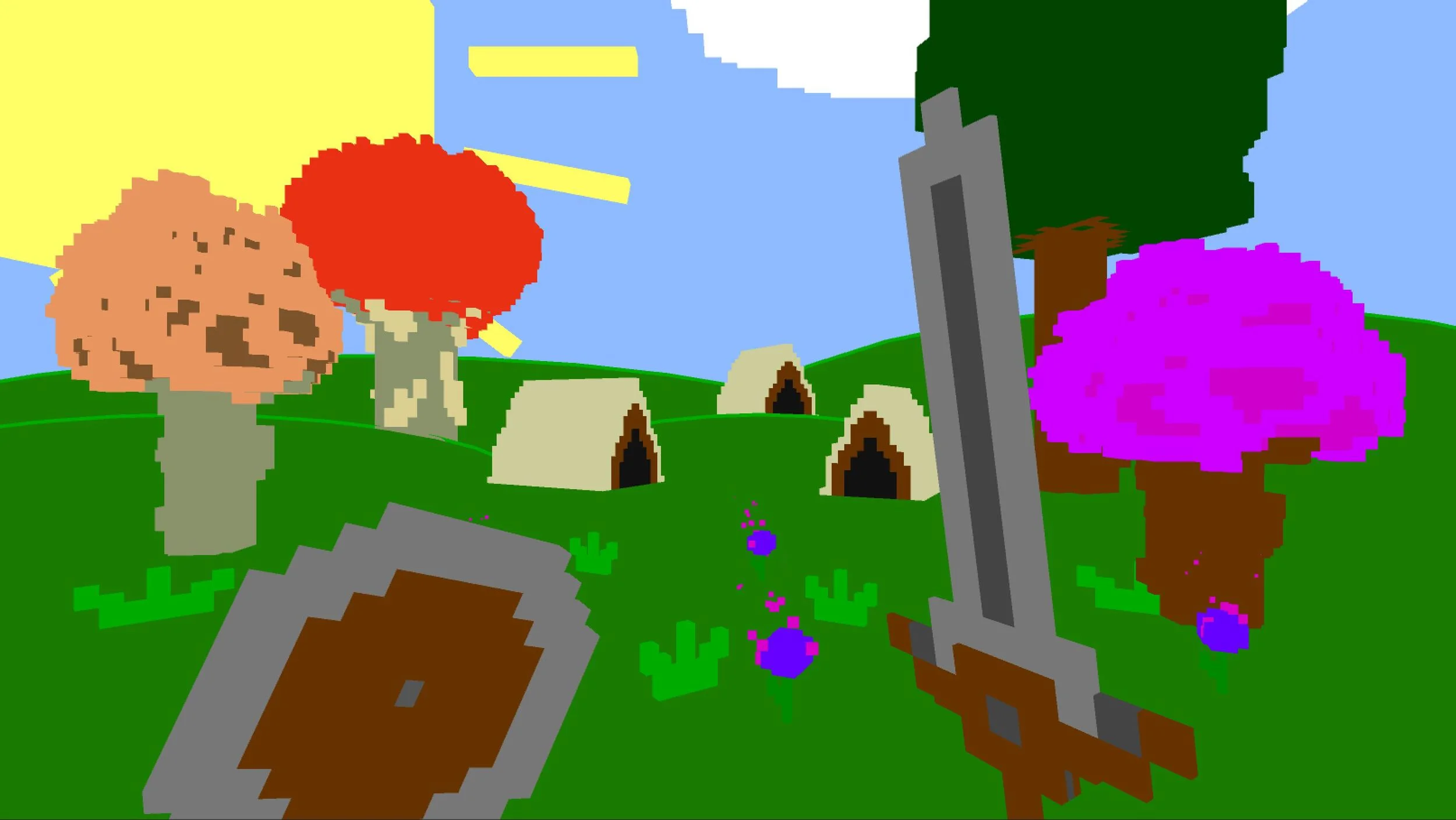
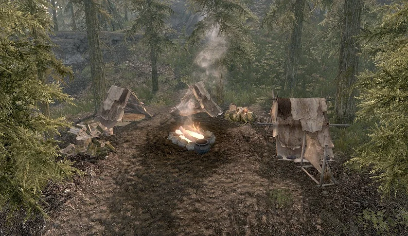
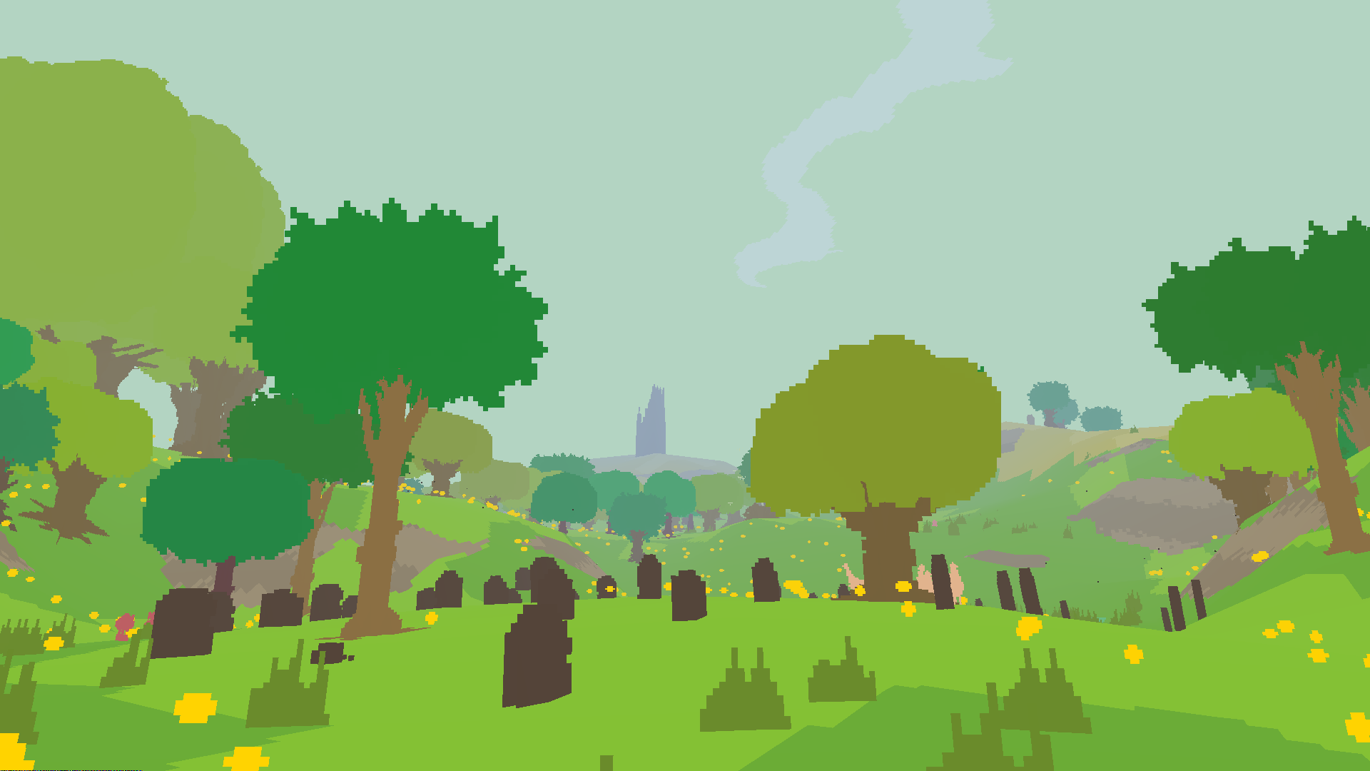
For this project, I took Skyrim and remixed it's design with Proteus's aesthetic. Skyrim was, at its release, probably one of the most graphically high end games, yet, when I played it, I felt like its visual aesthetic was just "realism". There's a big difference between graphics and aesthetic, and I felt that Skyrim, while graphically ambitious, lacked aesthetic. So, I found a game that has almost no graphics, and is all aesthetic--a game that is completely about its own aesthetic, Proteus. I wondered how Skyrim would change if it shifted from graphics to aesthetic, and wound up with this.
So the main two bits of Skyrim, and most games, are its environment and its interface, so I took and environment, swapped out the graphics, and completely removed the interface. I did this because I was noticing a change in Skyrim as it had these new graphics. I'd always played Skyrim as most of an exploration based walking simulator than anything else, the same way that I'd played Proteus, and adding in these graphics, I was even more drawn to just walking around that killing things. Removing the UI discourages combat, it shifts the focus of Skyrim away from its narrative, stripping away most of its interactions, and leaves us with a lovely voxel-based environment.
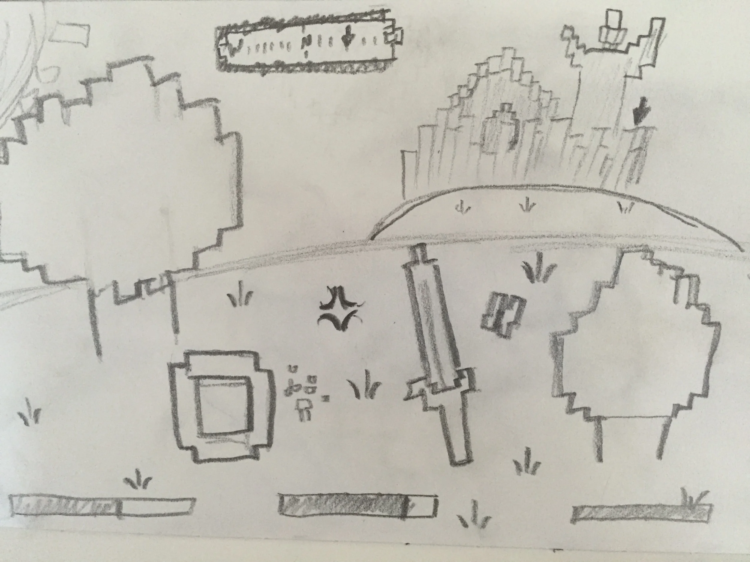
The big criticism I got before was that it looked like Minecraft, which it sort of does in the original draft. So, I made everything a bit more chaotic, more naturalistic, and it turned out a lot more like Proteus that way. I added hills and flowers, and grass to add volume to the scene, and thinned out the sword so it looked less like a Minecraft sword. The new image, I think, is well distanced from Minecraft.
Functionally, I had to break down Proteus, to see how they had achieved the aesthetic. I looked into billboards that simply face the player, but it wasn't that, the trees changed as you walked around them. I considered that it was just a 2D camera that removed depth. Then I found the Toon Shaders, which remove light from the objects. To accomplish the blockiness of the Proteus graphics I used Voxels.

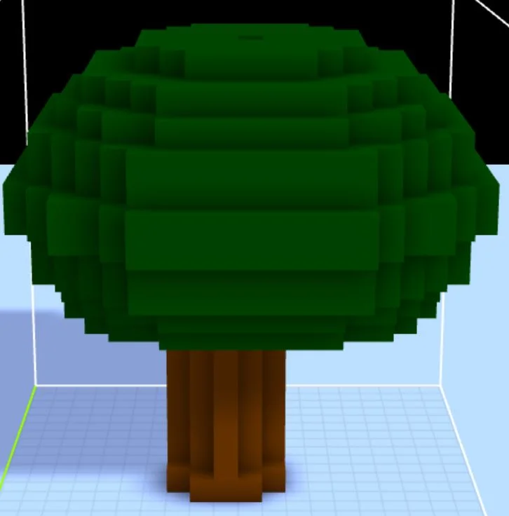
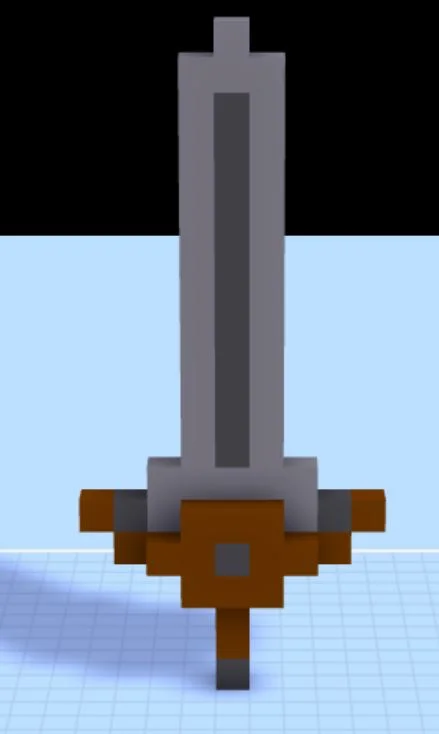
1. REMIX
2. I want to re-imagine the world of Skyrim with the aesthetic of Proteus.
3. We talked about the problem between graphics and aesthetic, and while I felt that Skyrim's graphics were gorgeously realistic, I didn't really feel like they had a whole lot of aesthetic aside from "realistic", graphically, not architecturally. I personally loved Proteus for its aesthetic--and I feel that it is quite opposite Skyrim in the sense that it is all aesthetic, and not very graphics intensive. So i'd like to swap them.
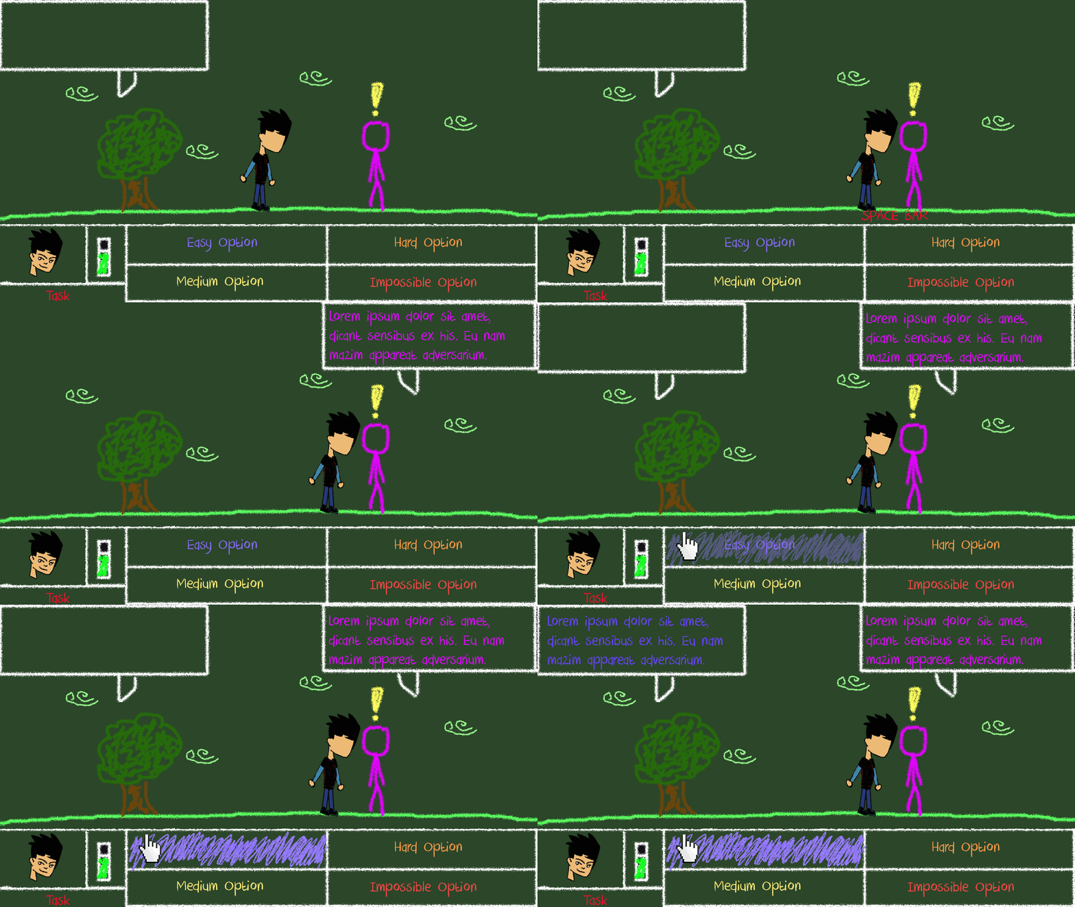
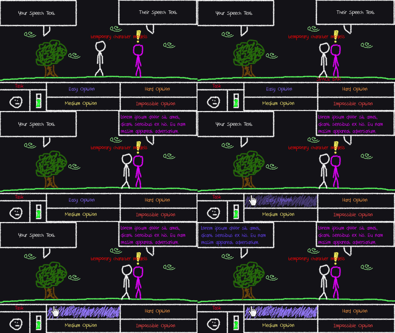
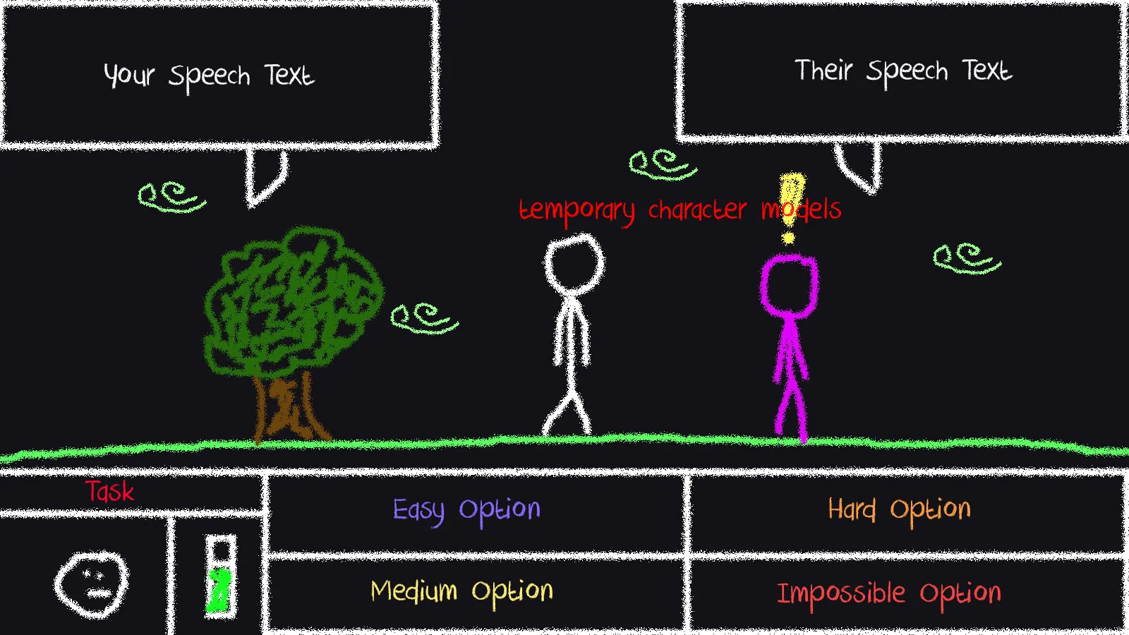
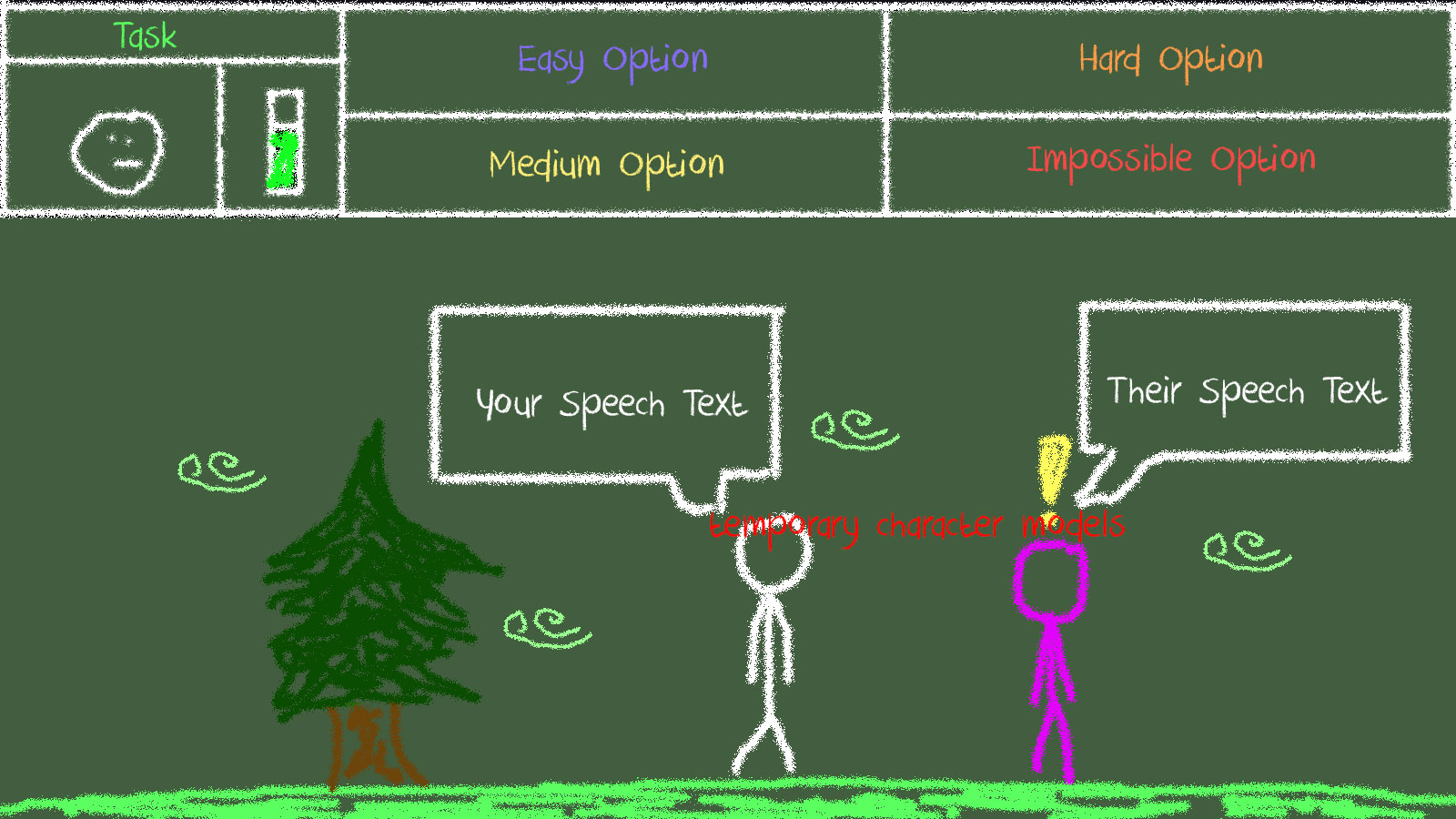
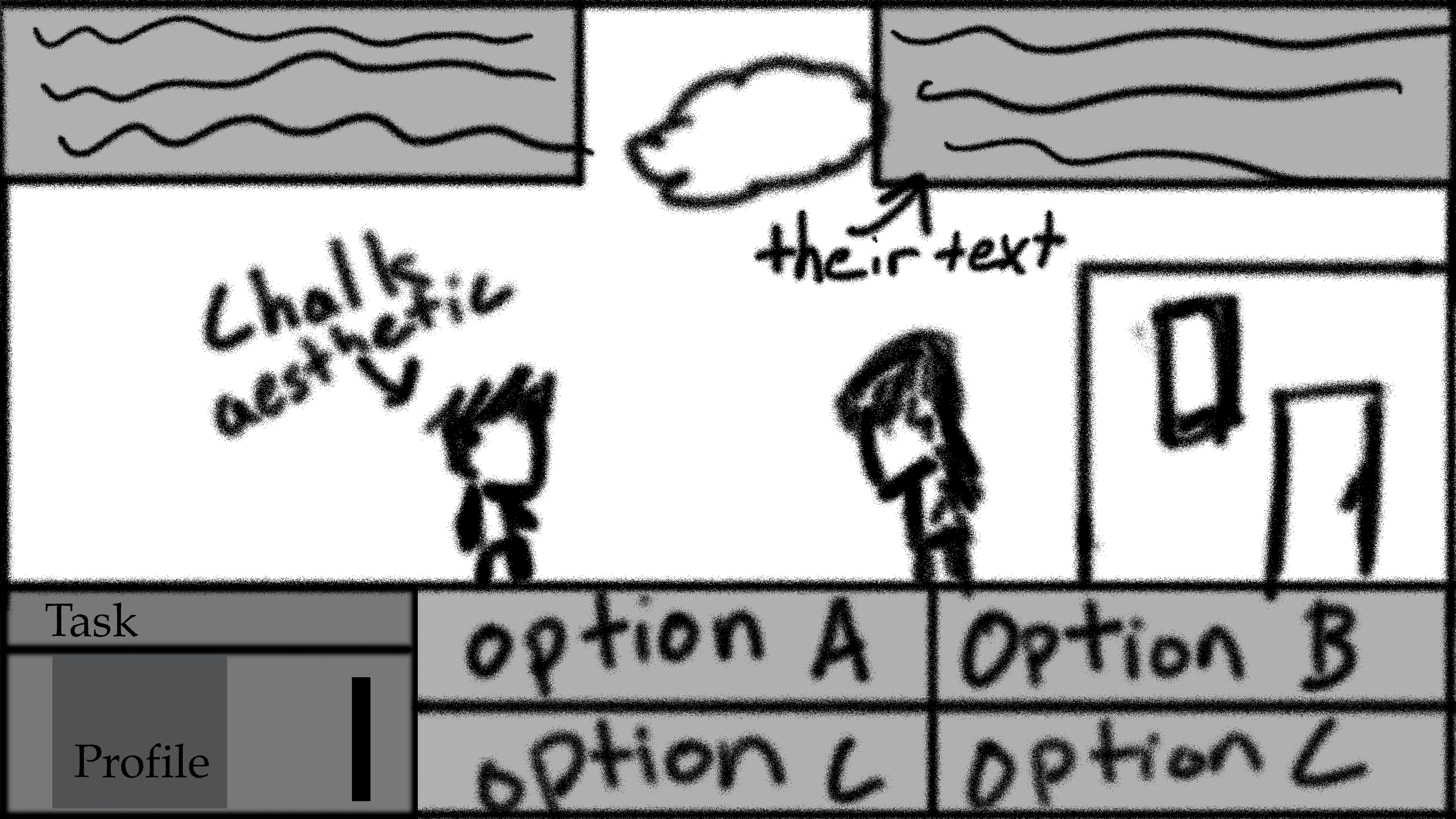
I moved the Task bar to beneath the player profile because, as you said, it seemed more natural. I agreed that the green looked a bit clearer than the black, though it was a bit too light to see some of the elements, so I darkened the green, and when with the bottom based UI.
In order to make speech clearer, I had the speech bubble hide when not being used. I also added a player bust to denote health, the player would start to frown as he got sadder. I made the lorem ipsum text more centered just to clean it up. I left in the scribble function to make sure clicking is super clear.
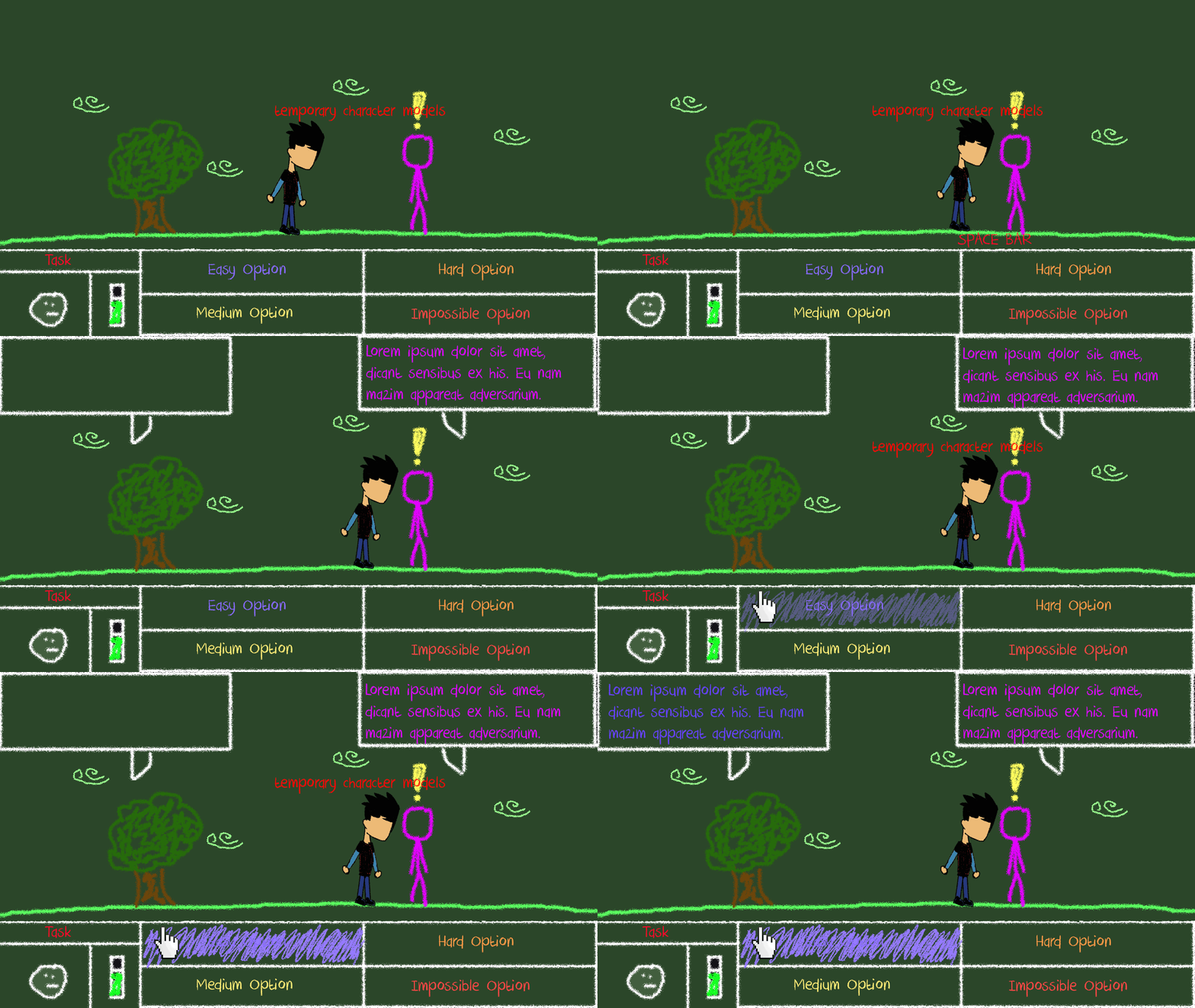
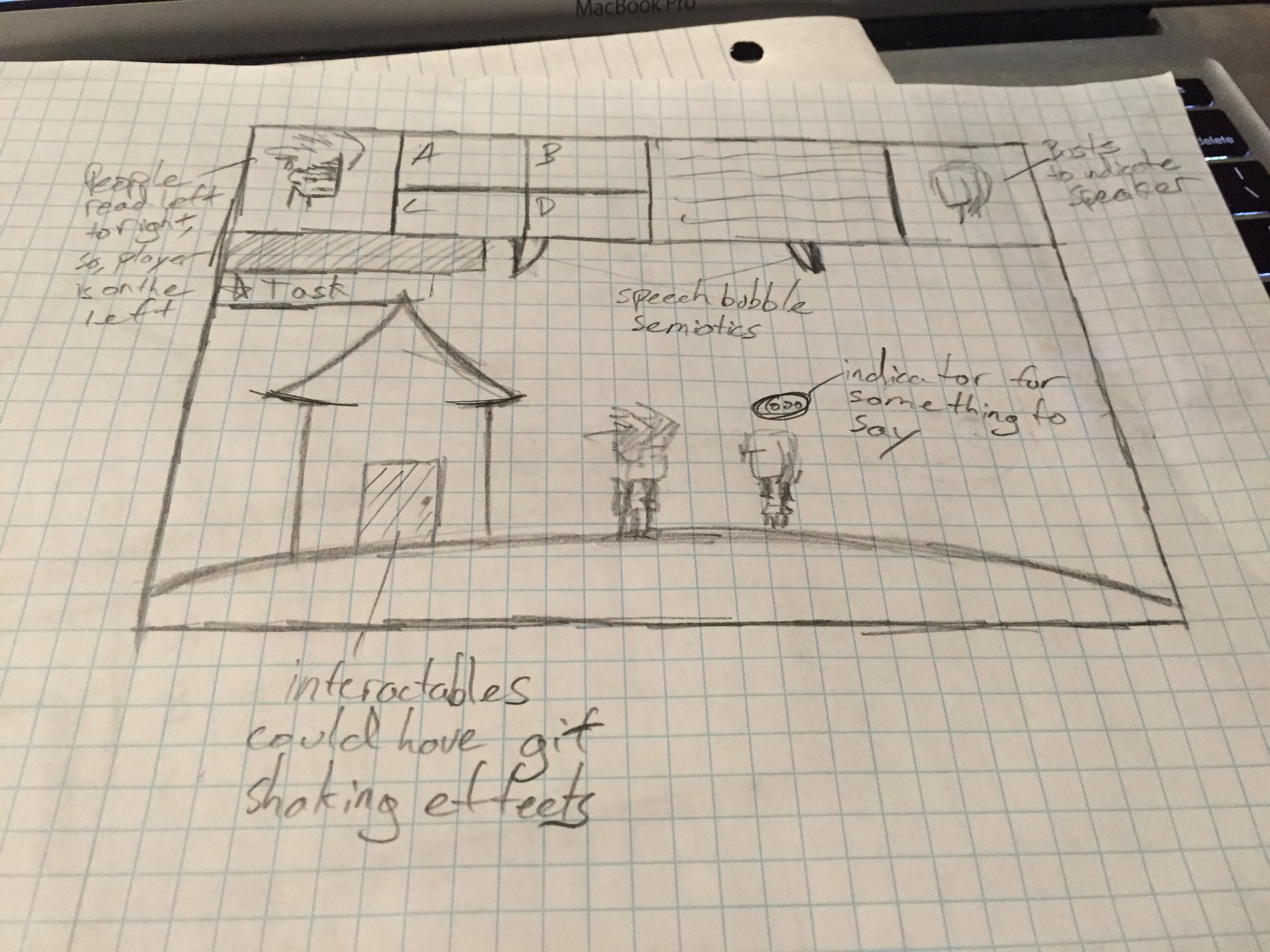
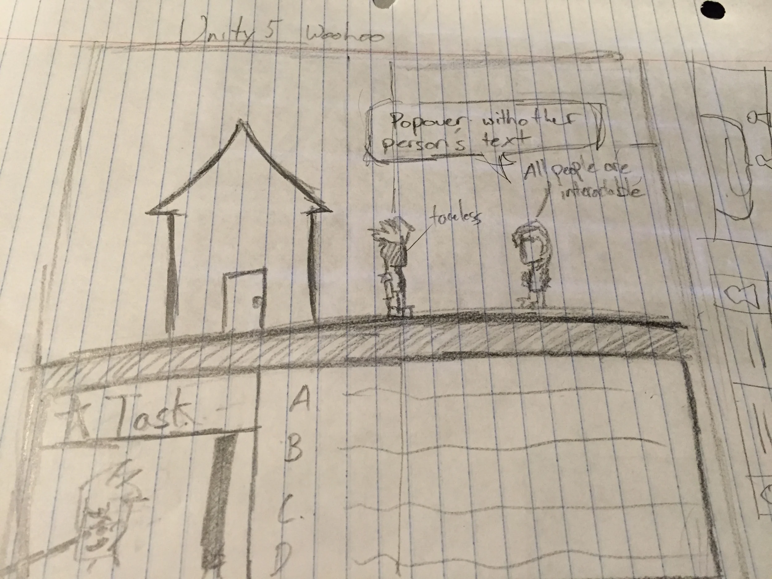
Old: Semiotics
1. I personally found the Scott McCloud reference very helpful. I was having trouble visualizing the Iconic, Indexical, and Symbolic modes interact with each other. The three, while related, didn't seem to necessarily exist in the same space. I'd been reading Scott McCloud's Understanding Comics, and in that book, McCloud uses the face example to show how a complex image or shape can be represented by minimum principles, like a smiley face. Apparently those principles are are the iconic, indexical, and symbolic modes.
2. I'm not convinced that the Wall Street Bull is a good example of Metonymy. Someone not familiar with Hayek's economic models may not quite get that reference. Surely those on Wall Street would (most of them anyways), but in general, until I took an economics class I thought the bull was just a big bronze bull statue.
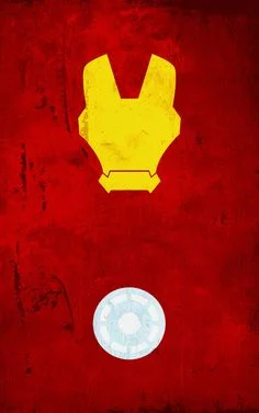
3. Who's that? It's Iron Man, and that's pretty obvious. How do we know it's iron man, it doesn't have eyes, or Tony Stark's awesome beard. This is because the image is on the far right side of the iconic, indexical, symbolic continuum. It isn't entirely symbolic, as it has indexical bits, the arc reactor isn't just a circle, there is detailing, though the helmet is, I think, as barebones as the Iron Man helmet could be while recognizable.
Scenes
1. I thought that the authors' point about Lesbian Queen of Mars was very interesting. I think it reflects a lot of the decisions that we as game designers have to make constantly, and the interesting emergence that can come from a mistake. In Super Smash Bros. Melee, half of the "standard" ways to move in competitive play revolve around exploiting a character's animation to allow for multiple actions to mix. This makes the game fast enough for the exciting fights that can happen in Melee.
2. I wasn't convinced by the author's point regarding Tombed. I don't think that it is an example of good design--surely there are many other ways to show the strategic uses of spikes than to basically kill the player a few times before they figure out the path. Had I never played Tombed before, I would have tried to dig straight down with immense frustration as the spikes killed me, before I realized that the destroy the metal walls. I think that it is an annoying design quirk that many prefer, but I don't think it feels good enough to the player to make up for it.
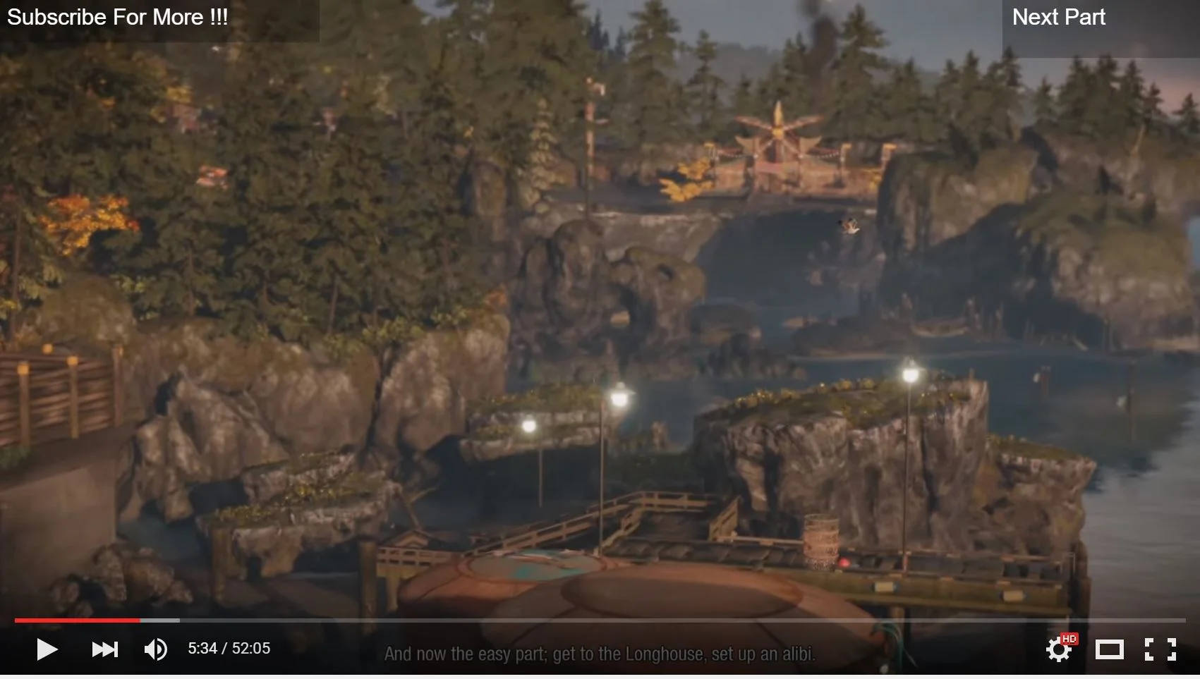
3. This is the first major gameplay scene in inFamous: Second Son. I think it displays the authors' point on the Mario Brothers possibility space, and how that applies in a 3D world. The camera pans around, giving the player their critical path, and shows the player that they will be needing to jump around these rocks, and probably climb them, to get the the destination, explained through narrative.
Interface Project
1. To display a selection of games.
2. Game selection, where a user will be able to access a synopsis, ratings, and reviews. A selector, where users can easily move through various games. And a player, where users can easily move from the selection process into the game and back.
3. People who like atmospheric mobile games. (if there is such a thing which there should be)
Quantitative Issues
I think my most important takeaway from this was with the Banks example, where the author talks about how the more dimensions your design has, the more disparate information you can display without loss of design clarity. With the football example it was similar, though I think that changing an entire team's colors for some design clarity might be a stretch.
I wasn't completely sure why the author used so many non-geographic representations of the electorate. After a few, I understood it was possible to display this information while breaking away from geography, though I disagree that no data is lost. I find that the geographic locations of the Red vs. Blue give a very important overall sense to the information being presented.
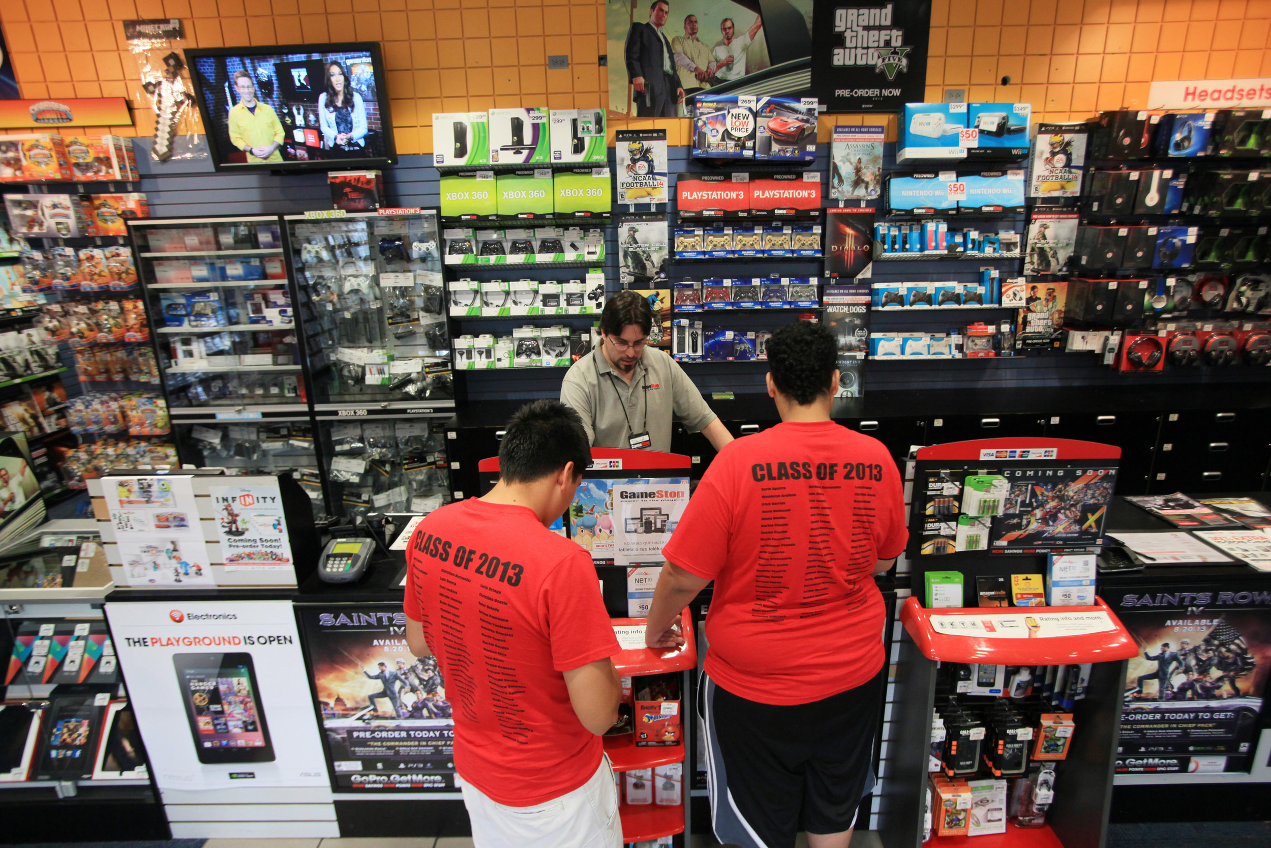
It isn't a graphic design, but it's definitely design. The vastly disparate colors of XBox, PlayStation, and Wii keep the storefront very easily readable for customers. There is no mistaking that the neon green belongs to XBox.
Qualitative Issues
I hadn't before really thought much about the design of the food plate and food pyramid. I can see how the author of this book would find problems with the implied hierarchy of a pyramid, and I remember feeling the same way as a child being taught this food pyramid. The grains on the bottom mean grains are less important than vegetables, right? Wrong.
Concerning the food plate, I hadn't really considered the impact of the dairy circle as its own thing. The author quickly beats down on it for its differentiation from the rest of the triangles in the plate.
When talking about color, however, I was a little confused at the app button example. I thought that it would be clear to press the center button because it was huge, in the center, and looked like a button, rather than the small red and green "buttons" which weren't actually buttons, but lights.
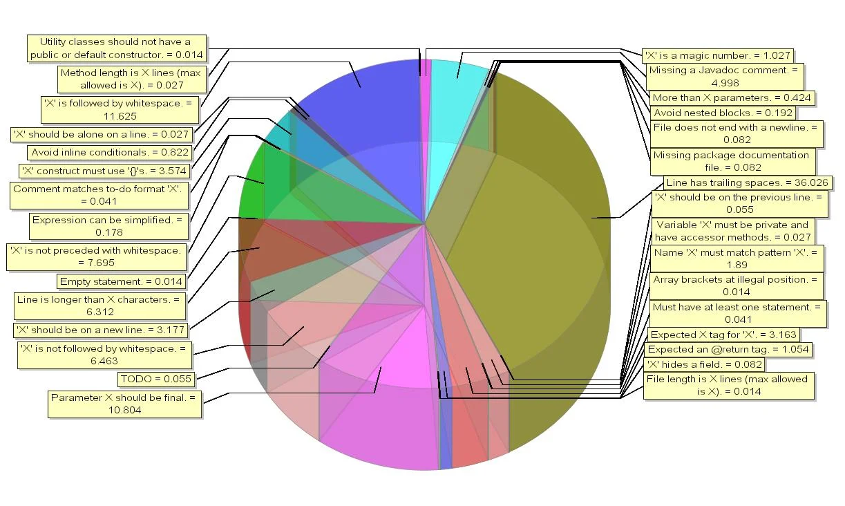
This image shows the dangers of not using distinct colors. Because of the 3D nature of the pie chart, the colors meld together and make it hard to read. Also, because there's now distance distortion, the closer wedges seem larger than the farther ones.
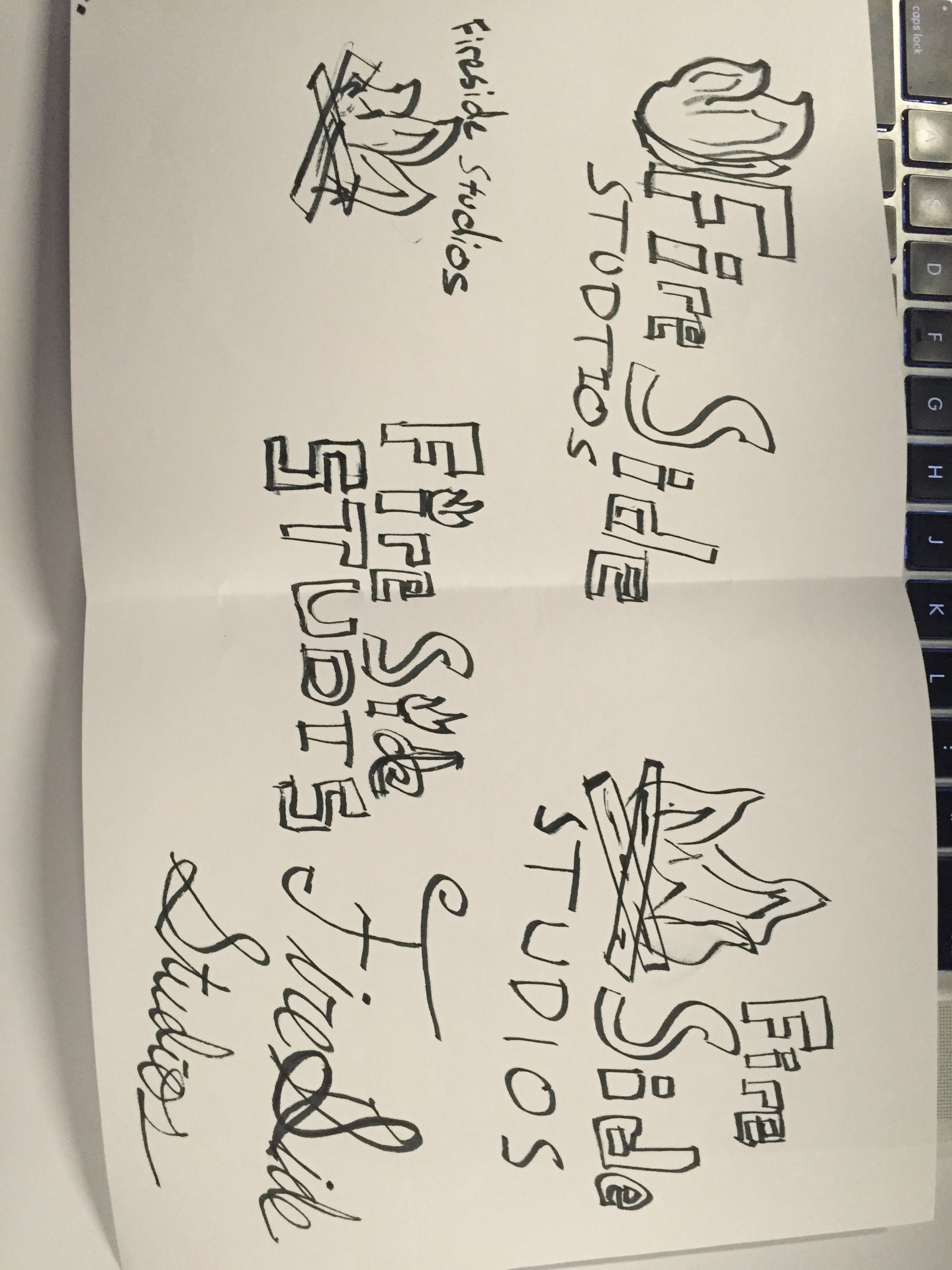
Fireside Studios
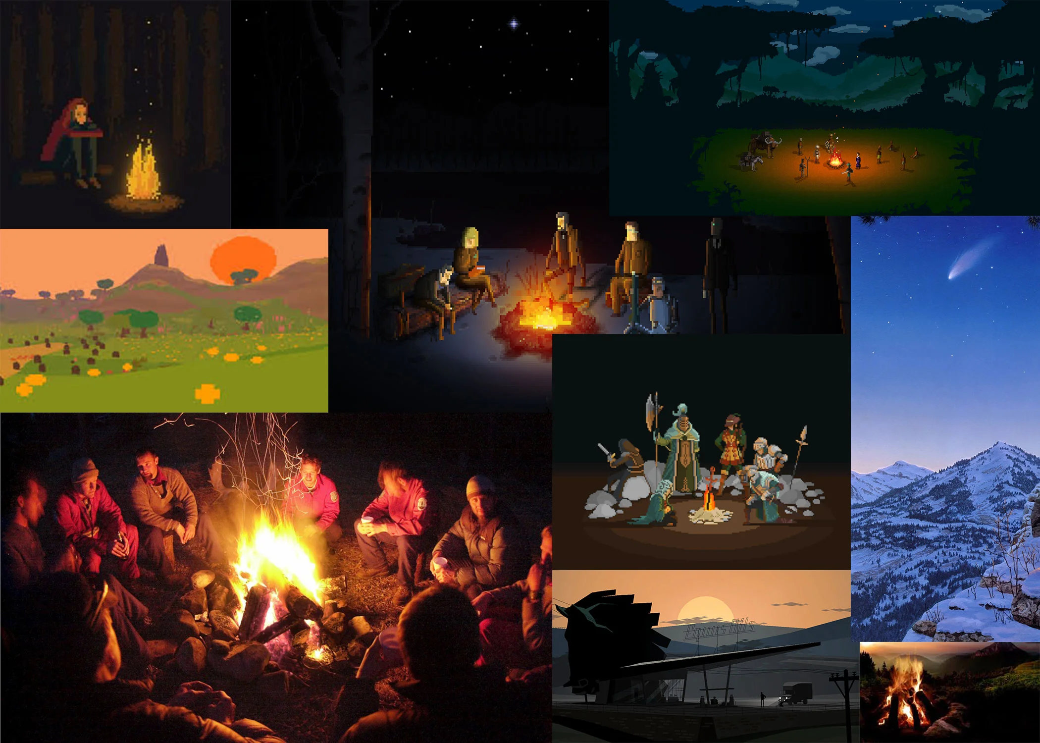
Fireside Studios is a small game studio focusing on narrative and atmospheric design. Our games seek to replicate the campfire story feel.
It is a student project to gain experience managing resources, building interesting games, and learning public outreach.
We like to think of games as a form of interactive art, so ludologists would be mad at us, because sometimes a game can just be a walking simulator. We like the player to rely on the atmosphere for narrative, rather than the mechanics.
Composition and Concept



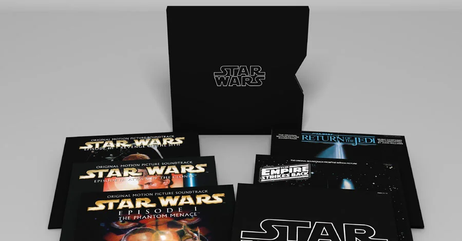


Exercise: Typeface
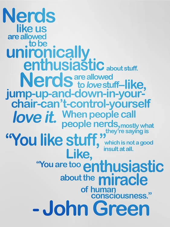
Supposedly, according to Fount, this is called 'Default'. But that might just be Fount thinking that this isn't even a font at all. WhattheFont couldn't quite figure it out, so I'll just call it default for now.
Default is a sans-serif font, focusing on readability. Each letter is clearly distinct from the others, the punctuation, I think, carries the essence of the font throughout. Default seems derivative of the Roman superfamily, with its curved edges, though far removed from the serif original.
I like it because its a fairly soft and neutral font, letting the actual words of the design come out without too much noise. The soft, also comic sans-esque strokes make the font seem youthful and playful, which, I think, lends to the nature of the quote-design at hand. The font also transitions between sizes well, lending to the general design.
Non-Designer's Design Book Reading Response
I hadn't really thought about using empty space before. My main experience with design has been environmental, and what I've been doing is trying to fill as much space as possible, thinking that the more stuff there is, the more enriching the atmosphere could be, like the Bioshock studio did. The use of empty space as part of the design is different to me, but possibly could add a lot.
It took me a couple of minutes to grasp the Alignment section. What I'd always been taught is that centered, symmetrical things catch the eye. But after a moment of puzzling over it, the asymmetrical nature of the example designs were far more eye catching because they weren't symmetrical.
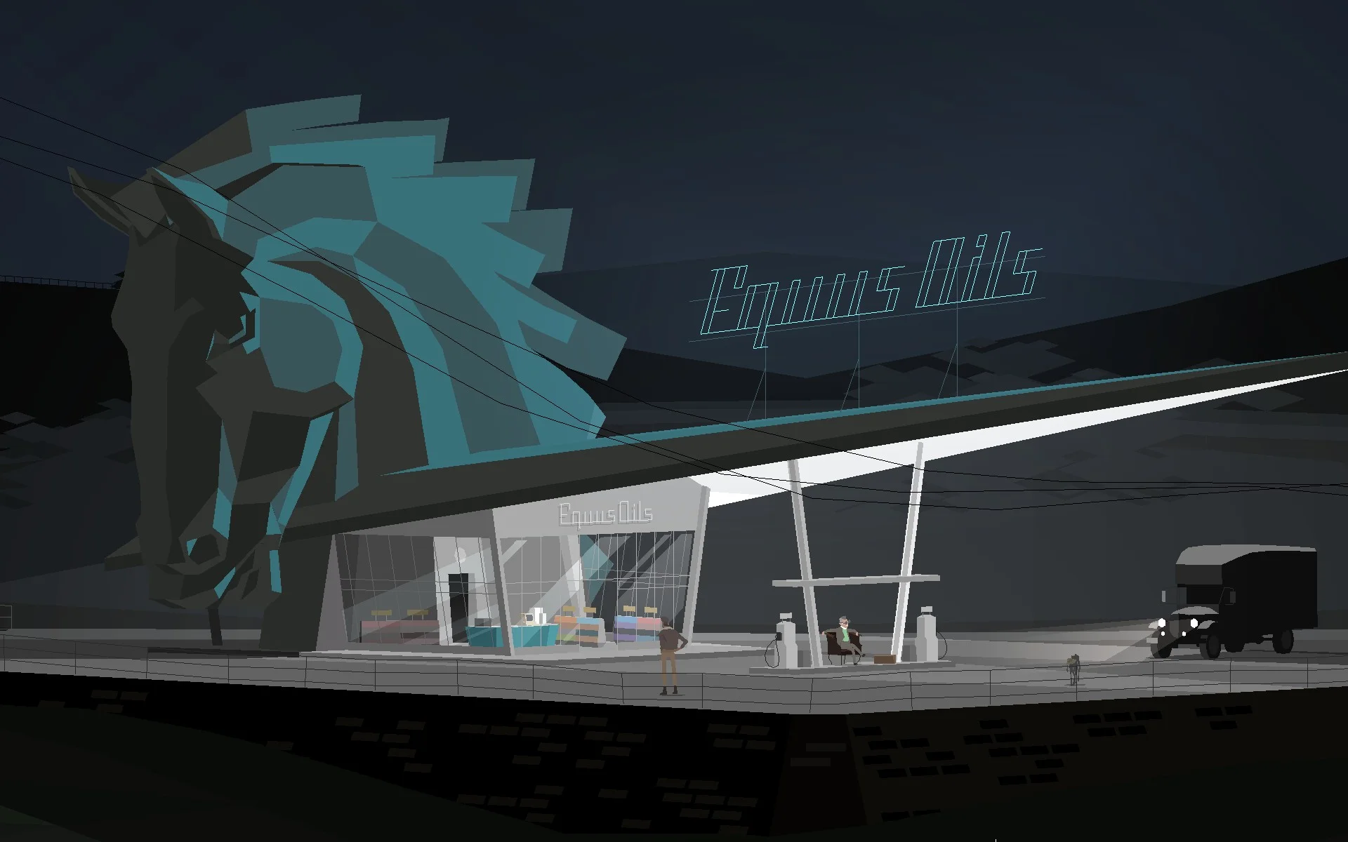
Kentucky Route Zero
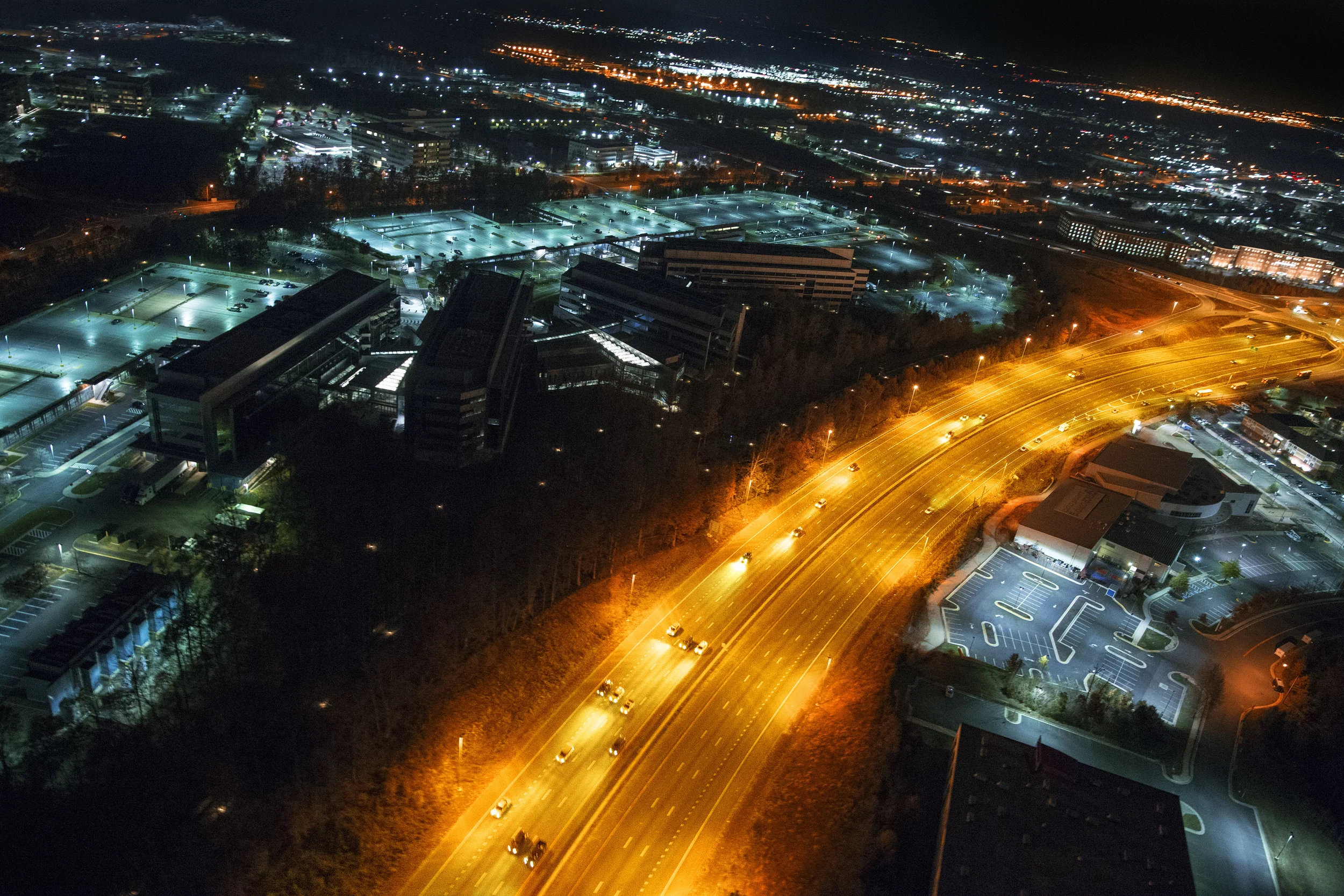
I think this image goes well with the minimalist concepts of 'empty space'. There's as much going on here as there isn't, and yet the atmosphere is far more evocative because of all that dark, empty space.
Exercise: Color
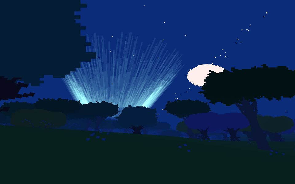
If it hasn't been made blatantly apparent: I like blue.
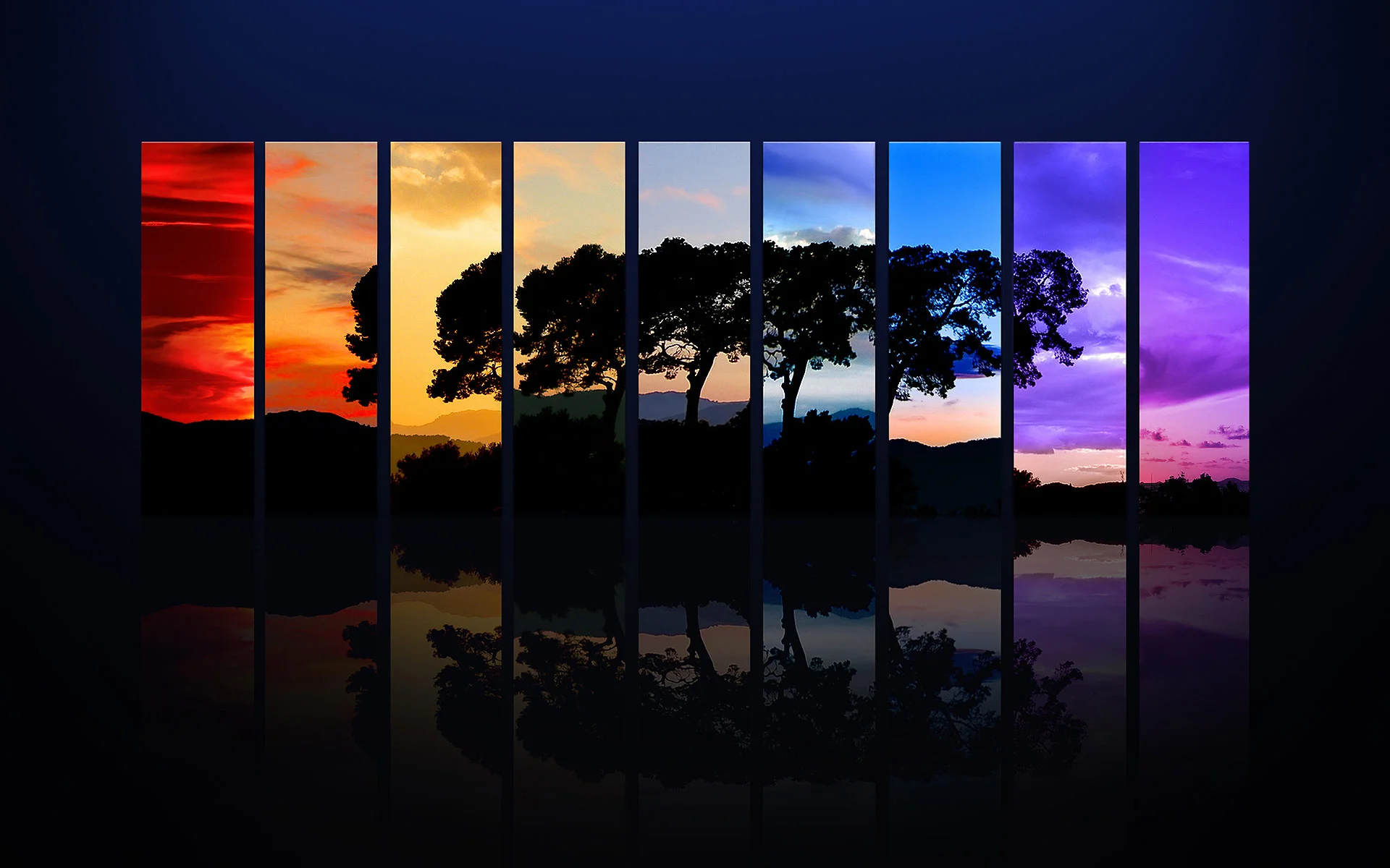
The main color here is the dark blue of the sky, a fairly saturated darker shade of blue. To indicate light, Proteus uses lighter tints, creating the aurora effect, and to indicate objects, Proteus employs darker shades of blue and green. Within the aurora itself, there are multiple shades of the saturated light blue color.
This shot revolves around the light source in the center, that aurora effect. It uses a tertiary color palette, centered in the aurora, and the analogous colors, like the darker blues and the greens.